Wheelhouse Branding
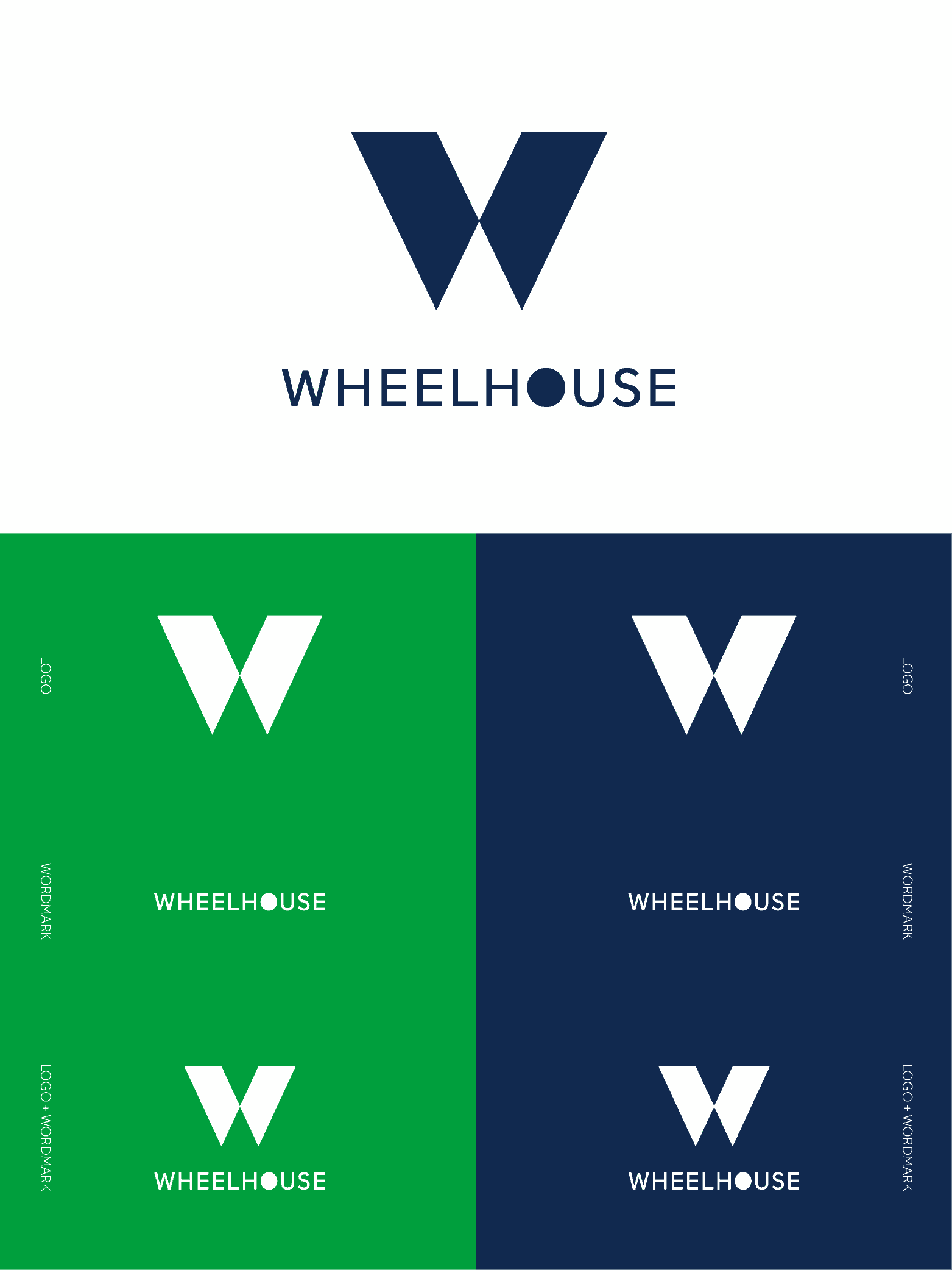
Wheelhouse supports manufactures engaged in business with large retailers by managing their sales and production efforts using cutting-edge technology. The client shared that the name, Wheelhouse, was chosen for its meaning which stems from the device a train uses to change the direction of its train cars. The client wanted a bold, modern, and timeless logo that embodied the ideas of cutting-edge, professional, and industry-leader.
When I began designing this logo, I started with the idea of converging paths that led to the paths forming a W. I used clean edges with sharp corners to bring forward the idea of cutting-edge, and designed the center of the logo to resemble a peak that relates back to “industry-leader”.
ClientWheelhouseServicesBrandingYear2020


