Kaus Insurance
Responsive E-commerce Website and Rebrand
Kaus is a large insurance company of 30 years with over 350+ products that is looking to sell pre-packaged insurance plans directly to online consumers. Kaus sought to create an online e-commerce marketplace where they could compete in the direct-to-consumer market and appeal to a younger, more digital savvy audience.
Problem
Since starting business, Kaus has operated as a traditional insurance provider, offering insurance packages to clients through agents. As the market changes to a more direct-to-consumer model, Kaus has been losing revenue to more modern DTC insurance offerings that offer their services online.
Solution
A modern and friendly updated brand to attract a younger, more digital savvy audience and a responsive e-commerce platform that allows users to filter through and purchase products directly from their large portfolio of offerings similar to an e-commerce platform such as Amazon or Walmart.
Year Completed
2022
Role
UX designer responsible for all research, branding, visual design, prototyping, and testing
Tools Used
Figma, Photoshop, Illustrator, Notion, Google Docs, Zoom
Methodologies Used
User Interviews, Empathy Maps, User Persona, Competitive Analysis, Secondary Research, Venn Diagram, User & Task Flows, Card Sorting, Sketching, Word association, Feature roadmap, Mid & High Fidelity Prototypes, Usability Testing, Affinity Mapping
Research
Secondary Research & Competitive Analysis
To discover how other DTC insurance brands currently handle their e-commerce offerings, I performed a competitive analysis and did secondary research into the DTC insurance market. This allowed me to gain insights into how other companies are handling their DTC offerings and informed questions I would need to ask in user interviews.
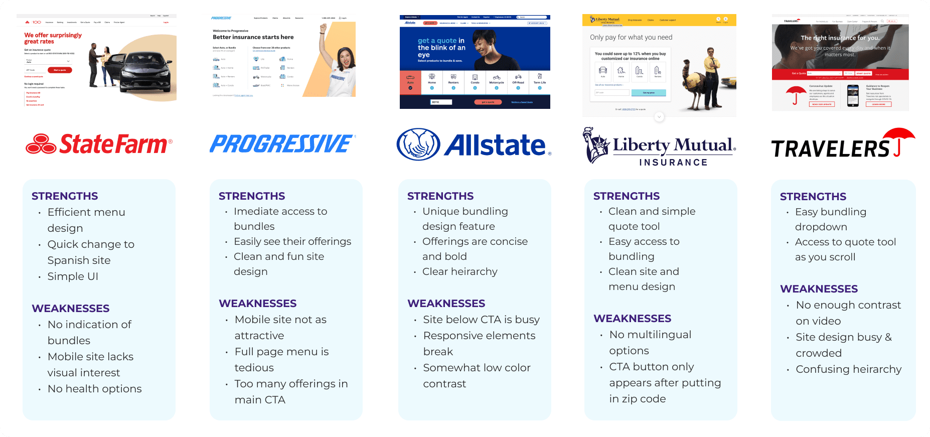
Key Takeaways
One
Most major insurance carriers offer DTC options for their clients
Two
DTC options are growing in popularity among younger, more digitally savvy users
Three
Major insurance carriers do not offer up-front estimates of the cost of their packages making it hard to compare prices without having to enter a lot of personal information
User Interviews
Using data collected from my secondary research and competitive analysis, I chose to interview digital savvy users between the ages of 20-40, users with experience in online purchasing, and users with experience purchasing DTC insurance as well as through traditional agent to consumer methods.
Key Takeaways
One
Overall, research shows that users in the 20-40 age range are interested in purchasing insurance online directly from a provider rather than having to go through an agent.
Two
Users are interested in purchasing insurance bundles for several reasons: Cost savings, Convenience, Streamlined management, Not having to go through an agent
Three
Most users report having issues understanding complicated jargon within insurance policies and would prefer to have them explained in more general terms
Four
Some users expressed the need to have more granular control over their insurance coverages.
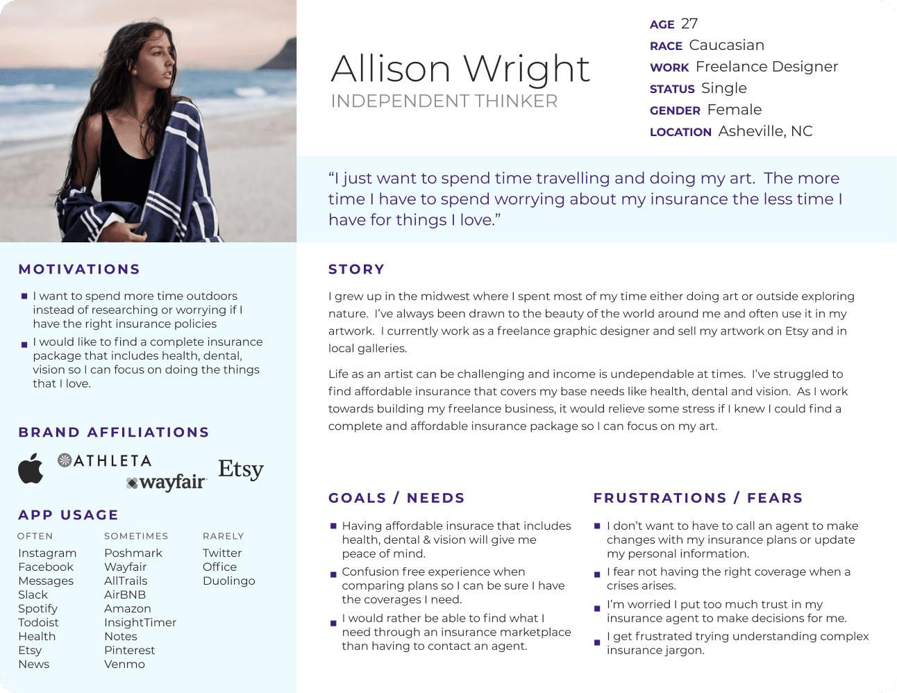
User Persona
“I just want to spend time travelling and doing my art. The more time I have to spend worrying about my insurance the less time I have for things I love.”
Designing Solutions
Information Architecture
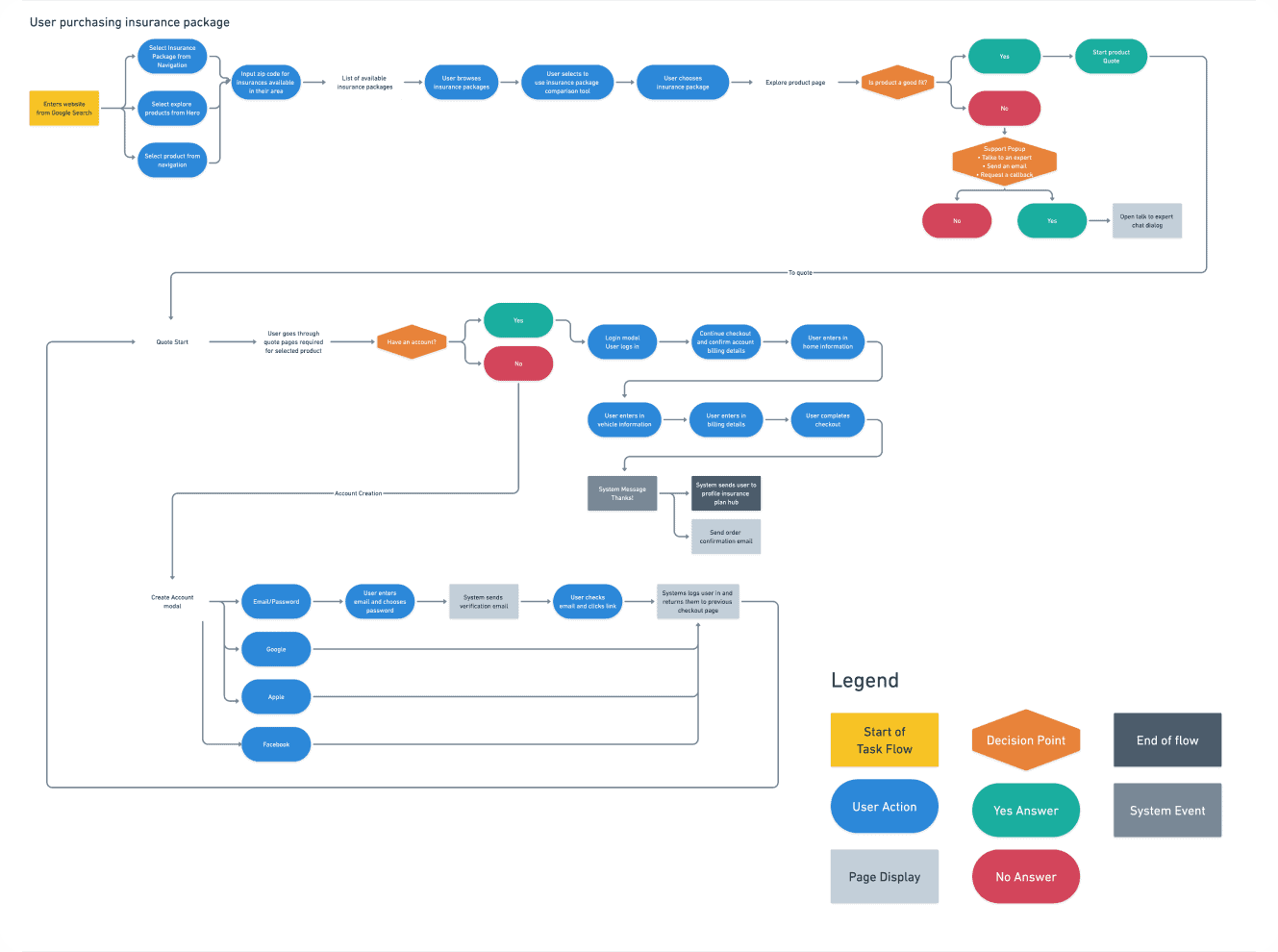
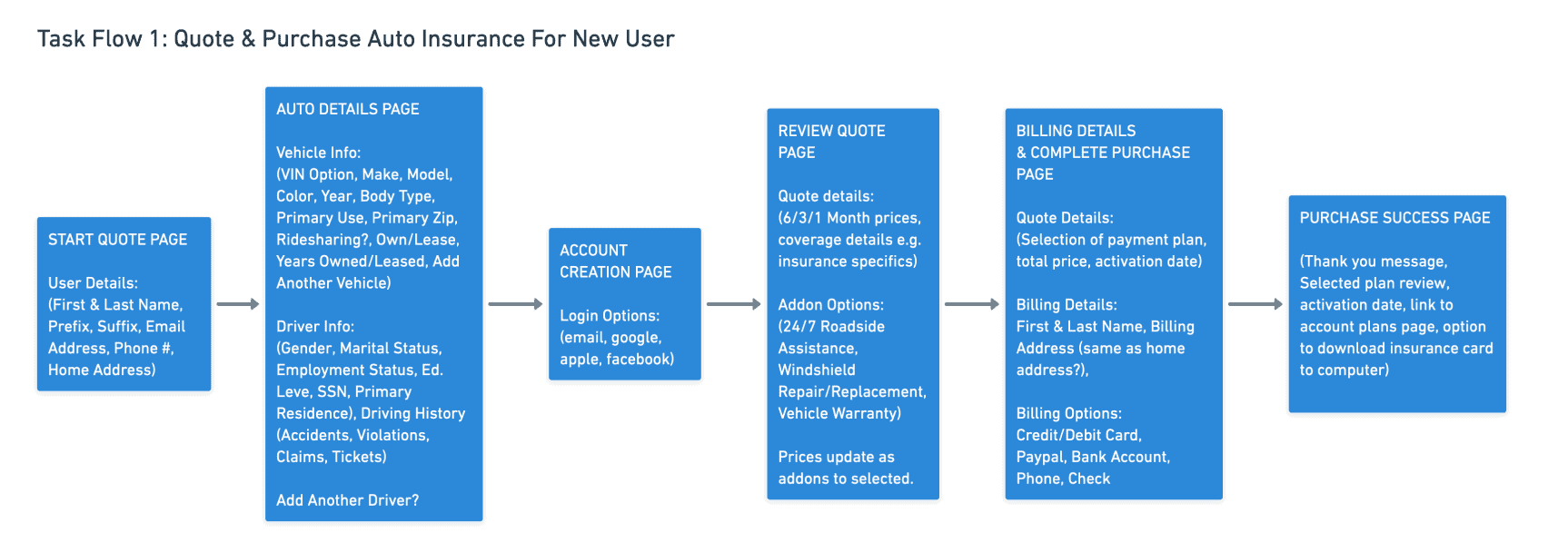
After wrapping up my research, I began exploring solutions by creating user and task flows to get a better understanding of the complexity of purchasing insurance and ways I might be able to streamline the experience for users.
Key Takeaways
- The purchasing of insurance is a complicated task requiring lots of user input.
- Much care would have to be taken in making the process as streamlined as possible
- Shortcuts should be added where possible ie,
- Efficient display of products for easy comparison
- Being able to duplicate address information across the checkout process
- Being able to use auto VIN# to pre-fill auto details
- Use of other sign-in/up options to make it easier to create an account
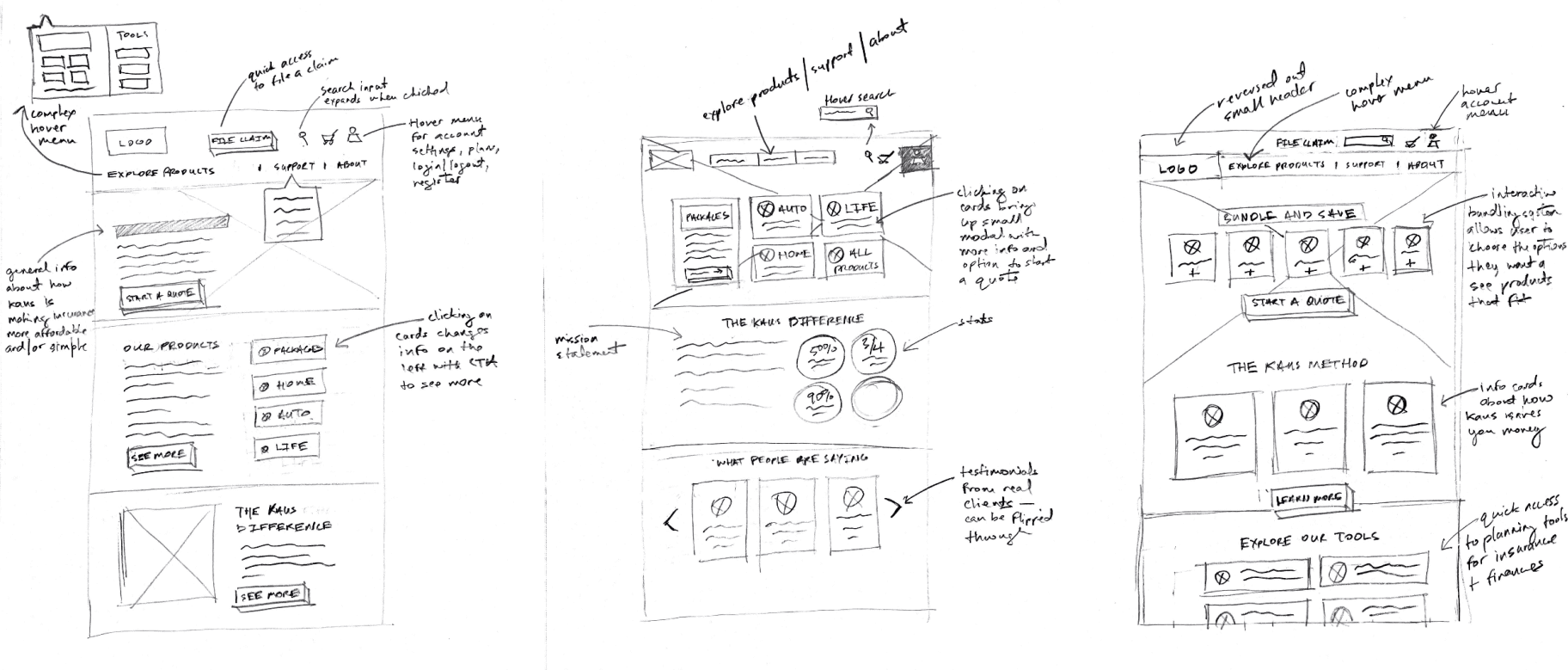
Sketching Solutions
Building The Brand
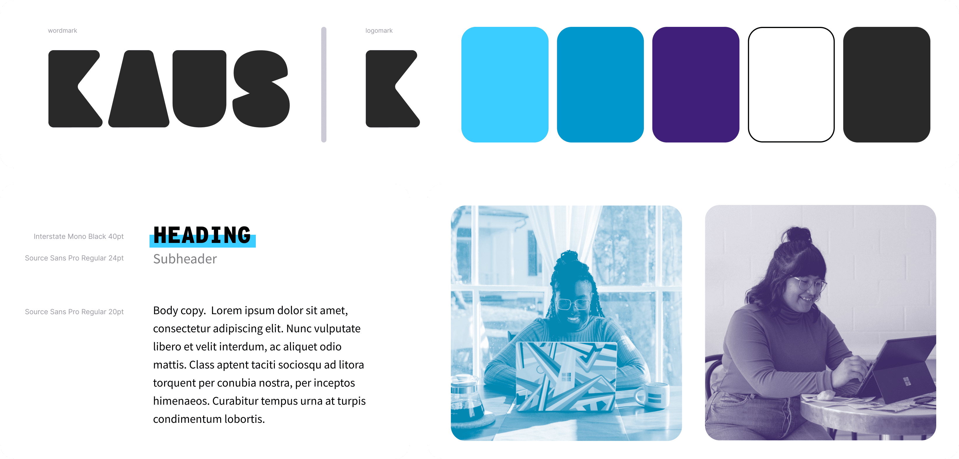
I took cues from Bauhaus style to create a friendly and approachable but distinctive workmark and logo type. The bold styling makes the logo very scaleable and adaptable. I chose a calming and but dynamic color palette that expresses security and trustworthiness to align with the business goals and provide a relaxed experience for the user.
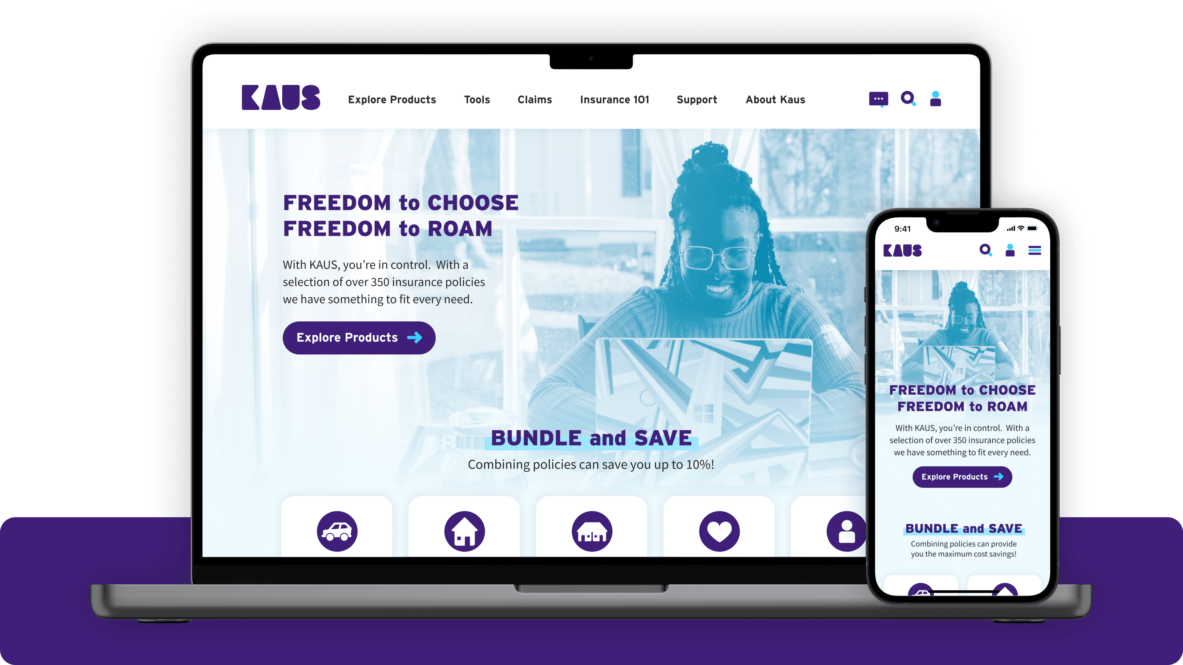
The Prototype
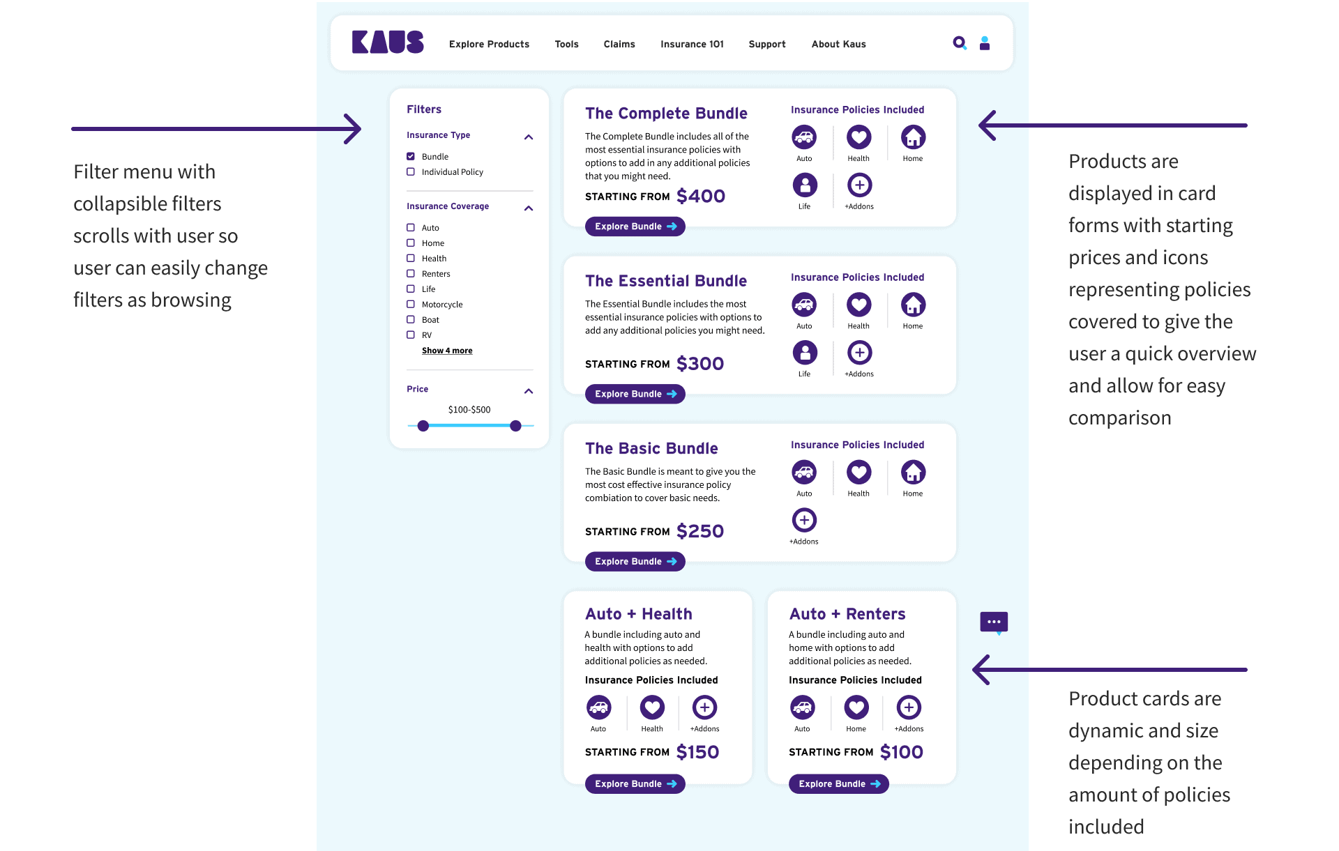
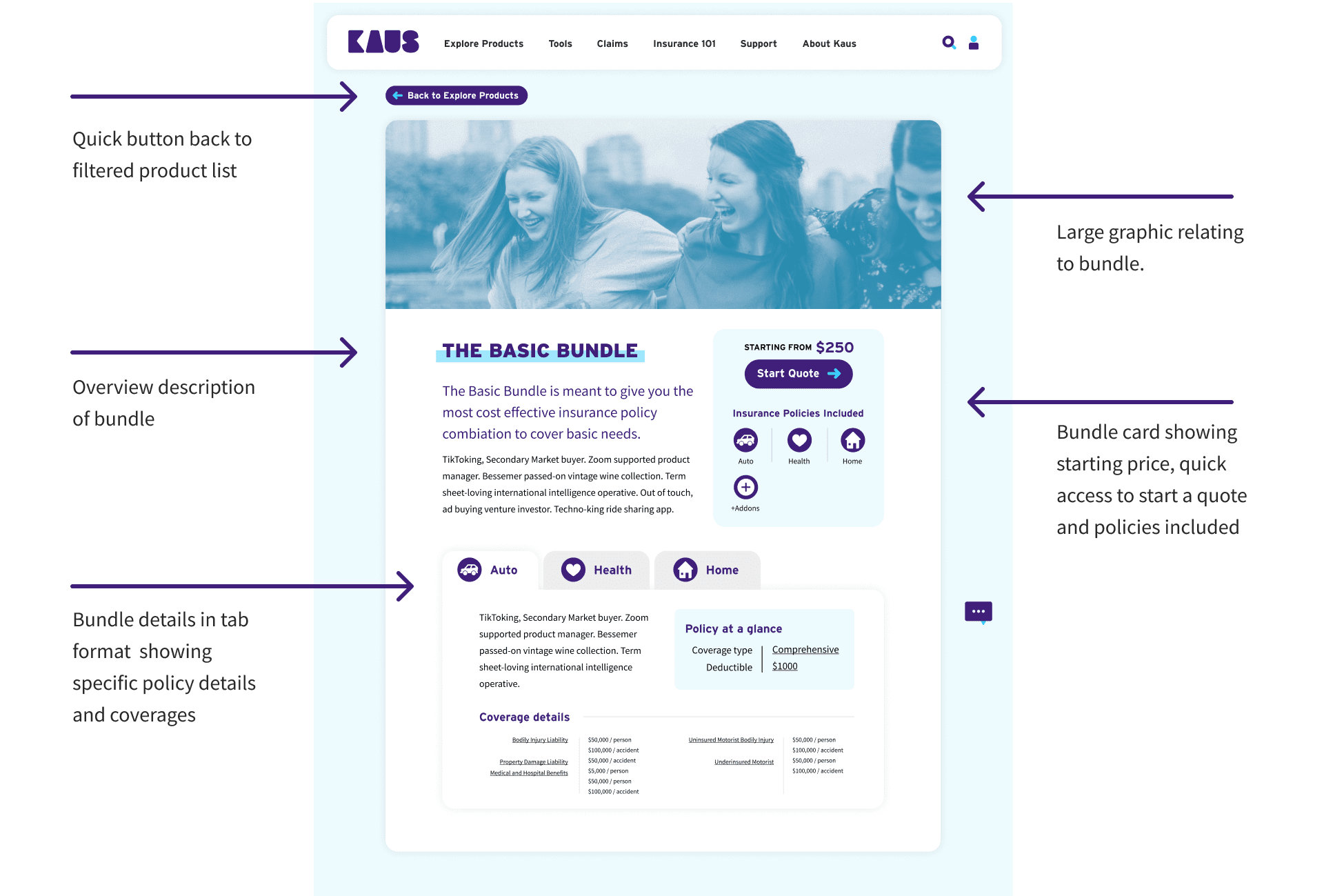
I wanted the site design to have the same playful and friendly feeling as the updated Kaus branding. Borrowing some of the design language from Bauhaus design, I used large blocks and rounded edges to soften the overall appearance of the site and layered them to create dimensionality. The large blocks also help with the responsiveness of the website, making it easier to transition from desktop, to tablet and mobile.
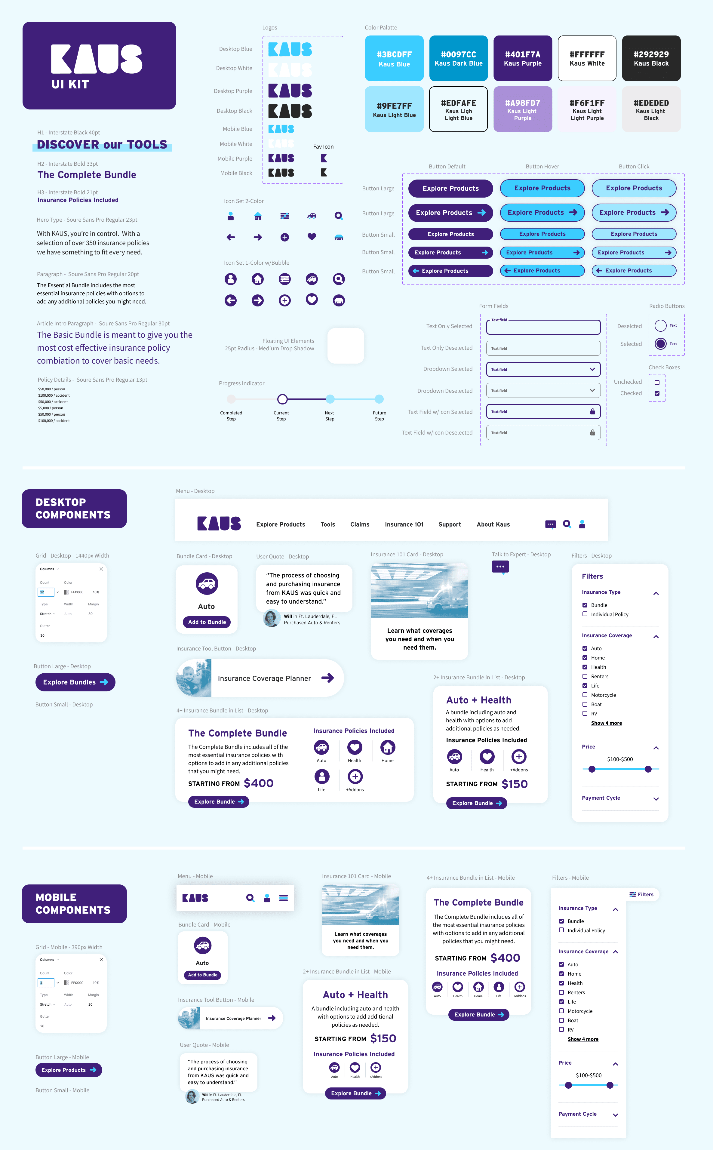
The UI Kit
Check out the video demo of the prototype below
Homepage
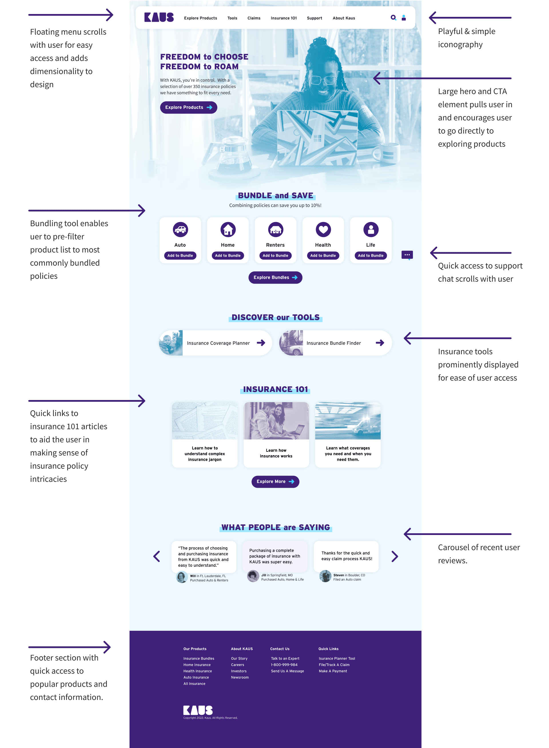
Explore Products
Product Page
Checkout Start
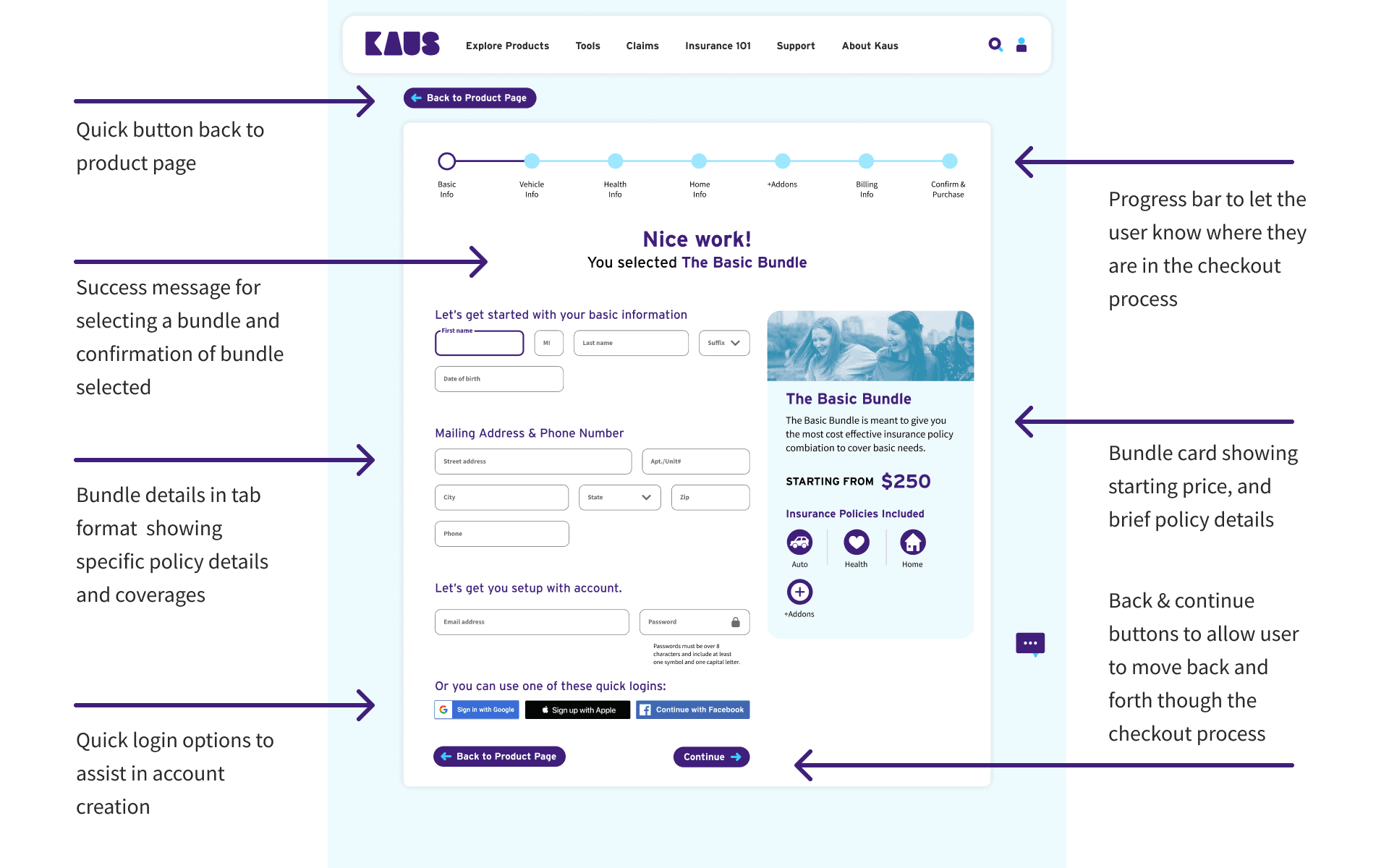
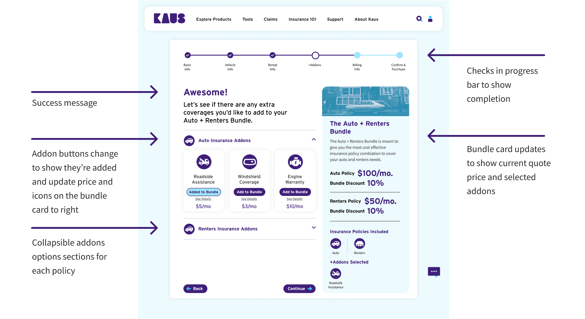
Package Addons
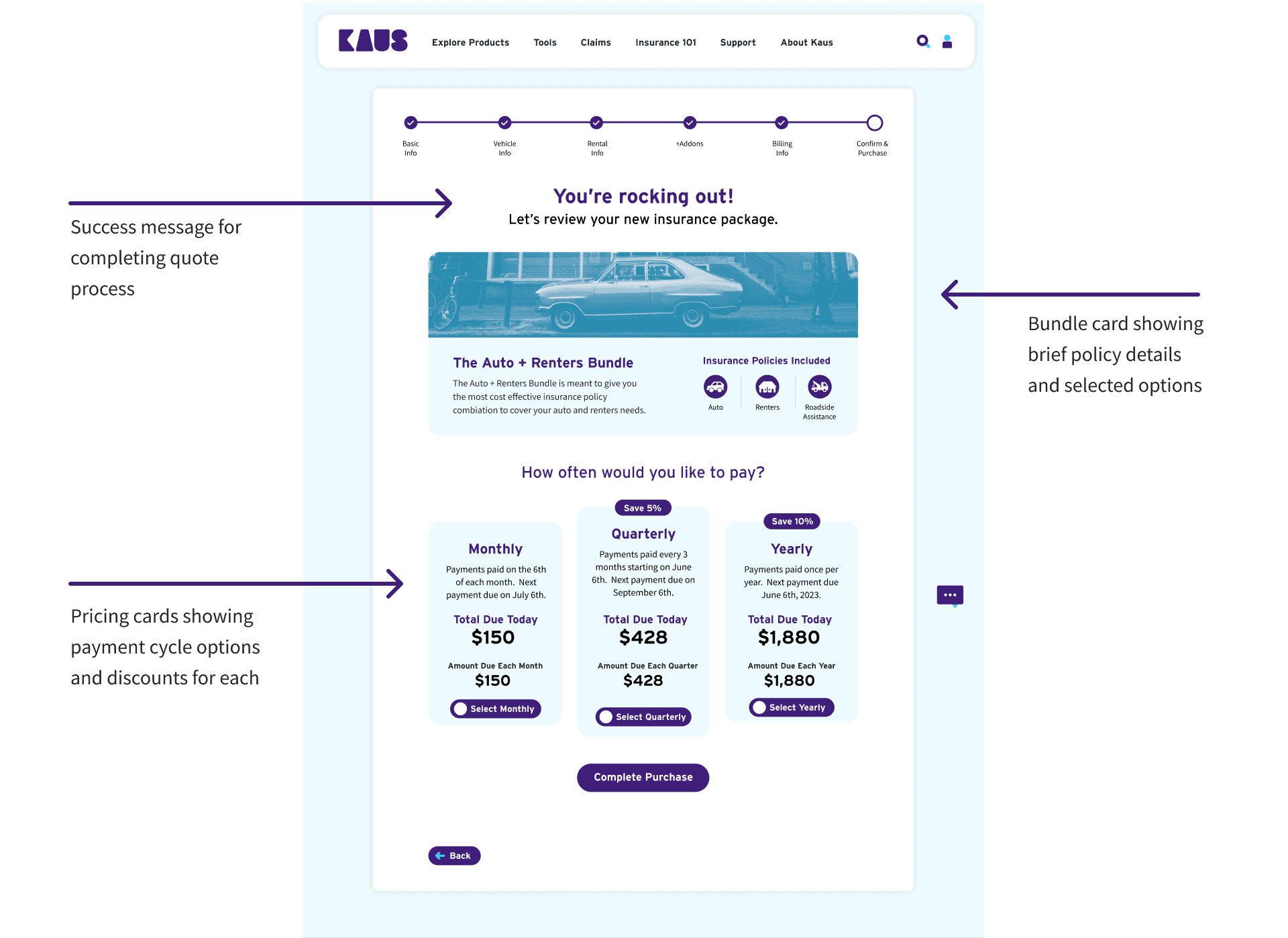
Checkout Confirmation
Testing
Usability Testing
After creating the initial prototype, I did usability testing to gauge how the site functioned for users. Testing was done as moderated sessions over zoom and users were asked to complete 2 tasks including Navigating to the Auto+Renters product page, Completing the Auto+Renters checkout flow as well as 2 sub-tasks: Adding “Roadside Assistance” to the bundle, and using the credit card payment option.
Key Takeaways
- 80% did not use the bundling tool on the homepage but instead used the explore products button from the hero element and then filtered to find the type of bundle for the task
- 80% users noted they liked the overall design of the site from an color, type, imagery, and layout perspective
- 80% users noted that the site was very clear, intuitive, and easy to use
- 40% users had issues determining if they should scroll or not on some screens
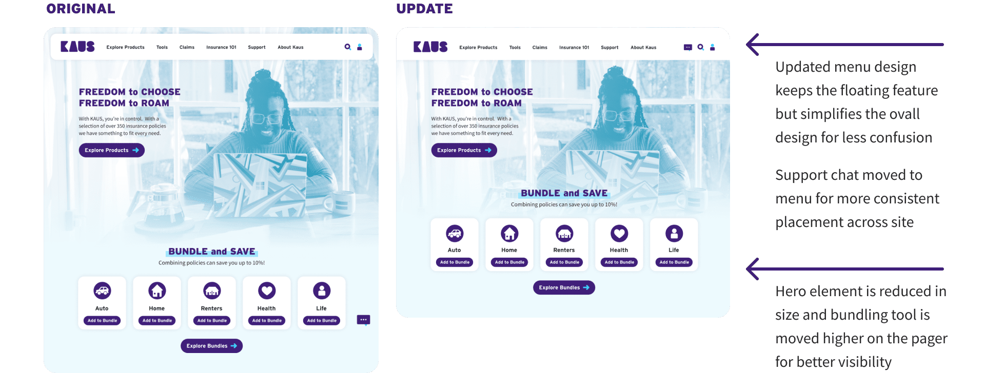
- 40% users were confused by the floating menu
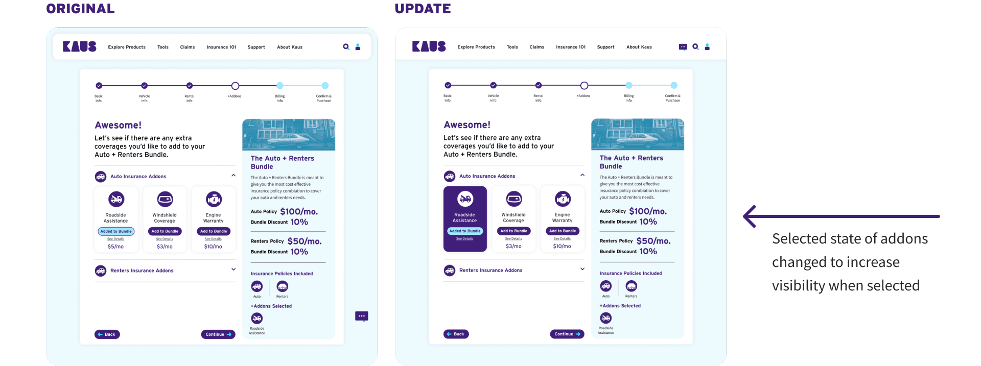
- 40% of users had trouble determining if the add-on was added or not once selected
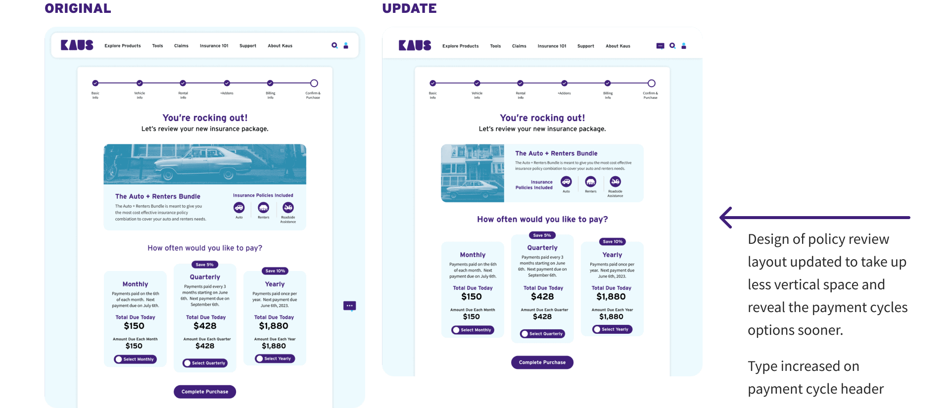
- 20% of users had trouble seeing the payment cycles section of the checkout completion page
Revisions
Homepage
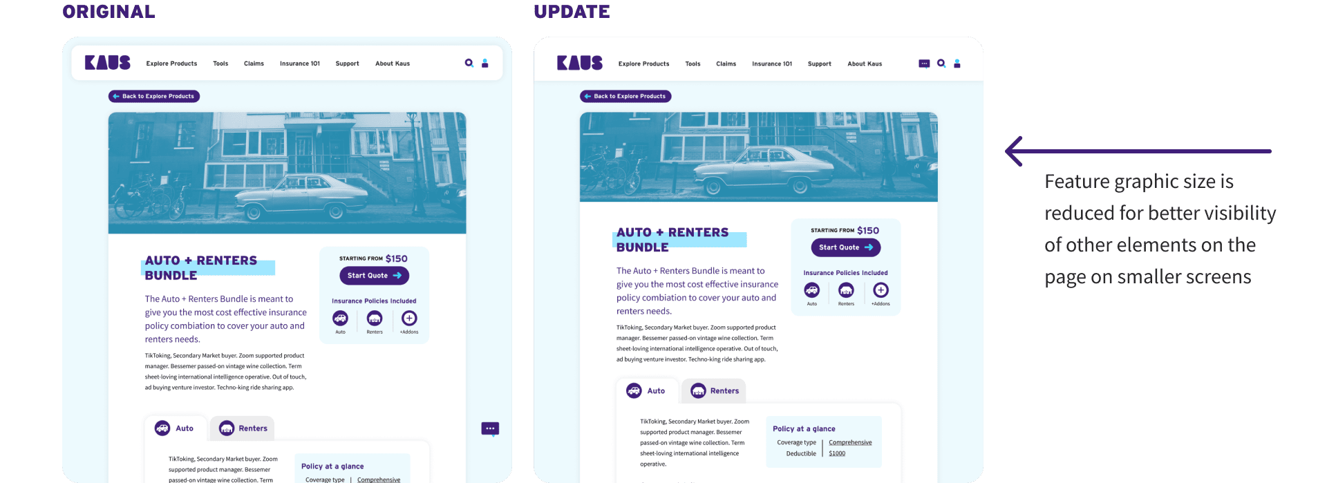
Product Page
Package Addons
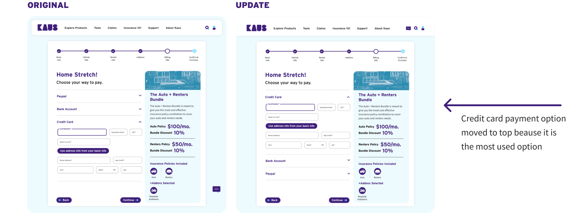
Payment Options Page
Checkout Confirmation
Conclusion
Moving Forward
- With the usability testing and prototype revisions done, further testing will need to be done on the prototype to determine if the last round of revisions solve the existing user issues.
- Design and prototyping of additional features/pages such as: Account Settings and User Insurance Hub, Insurance calculation tools,Insurance 101 educational hub
- Adaptation of prototypes to mobile
What I Learned
Designing using a duotone palette is challenging. Colors must be chosen and applied delicately.
Insurance purchasing is very complex and requires a lot of information to create accurate quotes. Task flows were very important in helping me determine what information was needed and where it made sense to request it.
Hierarchy on the page is extremely important in making sure the most information is seen in the order it’s meant to be.